As a project manager, you need effective tools to monitor processes and identify issues early.
One versatile tool that can be used in Project Quality Management to enable data-driven tracking and analysis of project metrics over time is the control chart.
By establishing control limits, this graphical tool signals when a process exceeds acceptable variability.
Control charts help you pinpoint problems, prioritize corrective actions, and drive continuous improvement.
In this article, we’ll cover everything you need to know about control charts including their creation, types, and how to leverage them to enhance quality control, boost efficiency, and bring better visibility and control to your projects.
We’ll also provide some tips on answering questions on control charts in the PMP exam as you can expect a few questions about these tools in the project quality management knowledge area.
What is a Control Chart in Project Management?
A control chart is a graphical tool used in project management to analyze process performance against preset control limits over time.
First developed by Walter Shewhart in the 1920s, it provides a visual display of measured data plotted against defined upper and lower control limits.
Control charts allow you to monitor key metrics like defects, cycle times, and more to assess stability and variability.
By establishing data-driven control limits, you can detect when a process exceeds acceptable variation. This signals the need for further investigation and potential corrective action to bring the process back into control.
In project management, control charts help you identify trends, patterns, and outliers. You can track metrics like budget variances, change requests, sprint burndown, and more.
Excessive variability may indicate problems like scope creep, resource constraints, or poor estimating.
Control charts transform abstract data into visual signals, enabling smarter process improvements to provide early warnings to prevent small issues from becoming major problems.
By reacting quickly when metrics exceed desired variability, you can optimize efficiency and quality.
With their simplicity and analytical power, control charts are invaluable quality tools for project managers seeking enhanced control, visibility, and continuous improvement.
Elements of a Control Chart
A control chart has several key components that enable statistical process control:
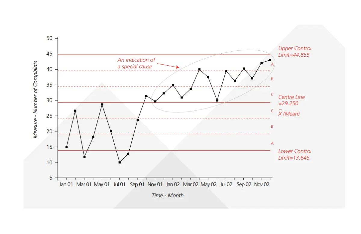
- Center Line (CL): The center line represents the mean or average value of the metric being tracked. It depicts the expected overall performance. For example, if monitoring daily wait times, the CL would show the average.
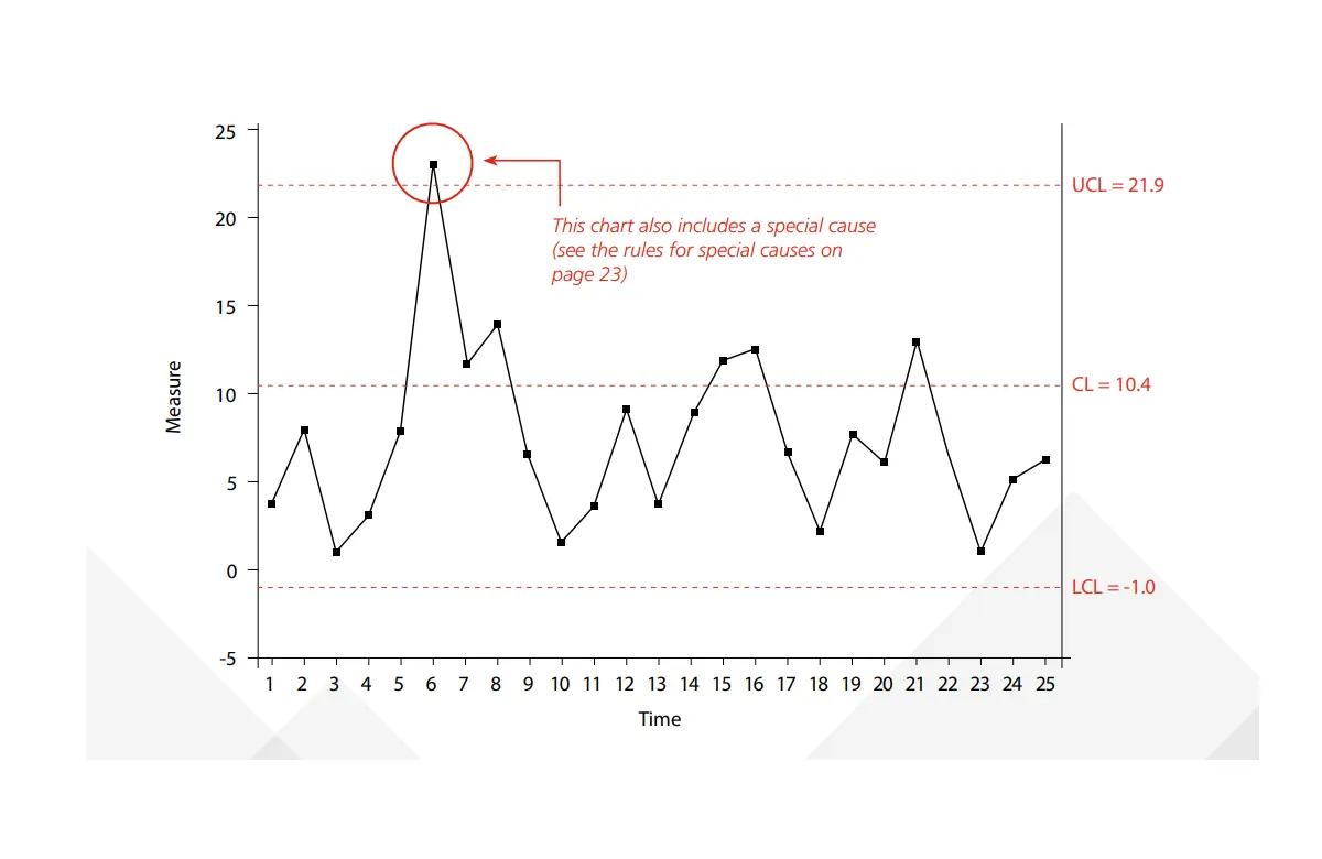
- Upper Control Limit (UCL): This defines the highest acceptable value before the process is considered “out of control.” It is typically set at 3 standard deviations above the mean. Points above the UCL signal unexpected variation.
- Lower Control Limit (LCL): This defines the lowest acceptable value before the process is considered “out of control.” It is typically set at 3 standard deviations below the mean. Points below the LCL signal unexpected variation.
- Data Points: These are the actual measured values for each subgroup sample. They are plotted over time to visually assess how the process is performing against the control limits.
- Subgroup Samples: Control charts track periodic subgroup samples, such as hourly or daily metrics, rather than continuous data. This allows detecting patterns over time.
- Specification Limits: Unlike control limits which are calculated from data, these are customer-defined acceptable ranges for the process output. Exceeding the specification limits means failing to meet requirements.
- Patterns/Trends: Control charts make trends and patterns highly visible. For example, you can see if process performance is slowly deteriorating over time.
- Annotations: Notes can be added to mark changes made or explain unusual points. This aids in interpretation.
Together these components allow statistical process control by transforming data into visual signals.
The control limits determine when to take a closer look and the center line shows the overall aim.
The Rule of Seven
The Rule of Seven is an important guideline for interpreting control charts. It states that if seven or more consecutive data points fall above or below the center line, it indicates a lack of control even if the points fall within the control limits.
This signals that the output is not as random as expected for a stable process. The unusual pattern likely means some new influence is acting on the process and warrants investigation.
While a point beyond the control limits unambiguously indicates a lack of control, the Rule of Seven allows the detection of more subtle issues.
It accounts for the theory that a random process should not have so many points in a row on one side of the average.
By watching for this pattern, you can discover problems and take corrective action before points exceed the control limits.
The Rule of Seven provides an early warning to prevent small process issues from becoming major defects.
When used alongside control limits, it offers a more holistic gauge of process stability.
Control Chart Types
There are two main categories of control charts used in statistical process control:
Variable Charts
These plot continuous, measurable data like dimensions, time, temperature, voltage, etc.
They include:
- Xbar-R Chart: Shows mean and range of subgroups to monitor process consistency over time. They are useful when dealing with small sample sizes.
- Xbar-S Chart: Shows mean and standard deviation of subgroups. They are useful for larger subgroup sample sizes.
- Individuals Chart (I-MR Chart): Plots individual observations with moving ranges. Checks variability of individual outputs.
Attribute Charts
These monitor count-based or pass/fail data like defects, errors, successes/failures, etc.
They include:
- Np Chart: Tracks nonconforming or defective units and helps improve quality by reducing defects.
- P Chart: Monitors proportion of nonconforming units. Aids in calculating process capability.
- C Chart: Tracks the total number of nonconformities across subgroups to uncover patterns in defects.
- U Chart: Plots nonconformities per unit. Helps detect issues affecting individual units.
Additional Charts
Other specialized control charts include:
- G Charts: Monitor group/category defects
- T Charts: Track conformity to specifications over time
- CuSum Charts: Detect small process shifts quicker
The type of control chart selected depends on your data and analysis goals as they are flexible across many metrics and industries.
The key is choosing the right variant for your needs and data characteristics.
How to Use Control Charts in Project Management
Control charts offer invaluable visualization for project managers seeking enhanced data-driven oversight of processes and metrics.
Consider these tips for applying control charts:
- Plot schedule or cost performance metrics over time to identify concerning trends or variability to enable smarter course corrections.
- Track quality metrics like defect rates, test pass rates, sprint burndown, or net promoter scores to improve products and processes.
- Monitor cycle times and lead times to optimize throughput, reduce bottlenecks, and improve predictability.
- Use attribute control charts to quickly detect spikes in incidents, bugs, or service complaints requiring attention.
- Leverage control charts to assess the stability and capability of agile teams, tools, and environments.
- Compare control charts to show relationships between two metrics like effort and defects or budget and scope.
- Overlay process changes on the control chart to assess their impact on performance.
- Make control charts visible via dashboards so everyone can interpret the trends.
- Use annotations to document experiments, process changes, or special causes.
- Update control limits as processes and systems mature to encourage continual improvement.
How to Create a Control Chart
Follow these steps to create a control chart for statistical process control:
1. Define your metrics and data
- Determine the process output or quality metric to analyze. Popular examples include defect rates, cycle times, and performance metrics.
- Decide the time increments and subgroups for plotting data. Common subgroups are hourly, daily, or by process batch.
- Gather historical data over a sufficient period to establish a baseline. The more data points the better.
2. Calculate the Center Line
Find the average (mean) of your overall data set. This becomes the central line representing the expected process performance.
3. Determine Control Limits
- Calculate the standard deviation, which indicates the normal dispersion of your data.
- Set the upper control limit (UCL) at 3 standard deviations above the center line.
- Set the lower control limit (LCL) at 3 standard deviations below the center line.
4. Plot Data and Control Limits
- Create a line chart with time increments on the x-axis.
- Plot your periodic subgroup measurements over time on the y-axis.
- Add the center line and upper/lower control limits to the chart.
5. Add Patterns and Annotations
- Circle any points outside the control limits or unusual patterns.
- Note any process changes made or special causes identified.
6. Analyze and Act
- Analyze the chart to identify stability, trends, and variations.
- Investigate and address any out-of-control signals per your quality plan.
7. Repeat Regularly
Update the chart with new data periodically to monitor your process.
Advantages and Disadvantages of Control Charts
The advantages of using control charts include:
- They aid in the visualization of process performance to complement data analysis.
- They easily detect stability and trends over time with control limits.
- Control charts help in identifying issues early before they escalate based on visual signals.
- They focus improvements on the most frequent sources of variation.
- They require only periodic sampling rather than constant measurement.
- They help determine whether processes are capable of meeting specifications.
- They facilitate data-driven discussions and decision-making on corrections.
- They are versatile for use across manufacturing, services, and business processes.
- They are easy to create chart analysis in Excel or statistics programs.
- They help assess the impact of process changes.
- They provide metrics to drive continuous improvement.
Disadvantages of Control Charts include:
- They require baseline data to calculate control limits accurately.
- Chart quality depends heavily on input data quality.
- Control limits may conceal small but important shifts.
- There exists a tendency to tamper with processes when reacting to signals.
- Lagging indicator for processes with long cycle times.
- They are open to overanalysis and confirmation bias.
- Training is required for proper statistical analysis and interpretation.
- Difficulty discerning common and special cause variation.
- They can only show the existence of a problem, and not its cause.
Control Chart Excel
Microsoft Excel provides accessible tools to create control charts for statistical process control.
Follow these steps:
- Enter your data with columns for each data series and rows for time increments.
- Use Excel formulas like =AVERAGE() and =STDEV() to calculate the mean and standard deviation.
- Set the center line at the average and the upper/lower control limits at +/- 3 standard deviations.
- Select the data cells and Insert a 2D Line Chart with time on the X-axis.
- Add Horizontal Lines for the center line and control limits using the mean and +/-3stdev values.
- Format the chart with a title, axis labels, data point markers, and legend.
- Update the source data to plot additional points as new measurements occur.
With these steps, Excel enables straightforward and dynamic control chart creation. The graphical statistical process control visibility improves monitoring, analysis, and decision-making.
Consider Excel Add-ins to enhance control charts with:
- Statistical rules to flag outlier points.
- Capability scorecards.
- Automated data feeds.
- Control limit determination.
Control chart Example
Let’s walk through an example to illustrate using control charts in practice.
A factory monitors the diameter of pistons produced in a machining process to control quality.
Samples are measured each hour and plotted on an Xbar-R control chart tracking the mean and range.
The process mean is 2.45 cm and the standard deviation is 0.03 cm. The upper and lower control limits are set at 3 standard deviations from the mean. Hourly sample measurements are plotted over two days.
On day 1, all points fall within the control limits indicating stable performance.
On day 2, the first 4 hours remain in control, but then the next 3 hours exceed the lower control limit signaling unexpected variation.
The quality team investigates and discovers the measuring gauge was bumped and miscalibrated after the 4th hour. This special cause is noted on the chart. The gauge is recalibrated and the process returns to normal limits.
This example illustrates how the control chart signaled when piston diameters exceeded expected variability due to an identifiable issue. It allowed rapid detection and correction before more pistons were machined incorrectly.

Control Chart PMP Exam Tips
A control chart is a tool used in Project Quality Management for data representation in the Control Quality PMBOK process.
For the PMP exam, these tips will come in handy to answer questions from the Quality Management knowledge area:
- Process Identification: Control Charts are primarily used in the Control Quality process in the PMBOK guide. Be sure to remember this during the exam.
- Understanding Limitations: Grasp the significance of control limits (usually set at ±3 standard deviations) and specification limits. Points outside control limits indicate the process is out of control.
- Interpreting Patterns: Learn to identify patterns like trends, cycles, or irregularities. A process might be in control but not capable if it does not meet specification limits, even without points outside control limits.
- Rule of Seven: Remember the Rule of Seven. Seven consecutive data points on one side of the mean suggest the process may be out of control.
- Use in Quality Management: Understand how Control Charts aid in predicting process performance, identifying variations, and guiding process improvements.
Conclusion
By transforming data into visual signals, control charts enable real-time monitoring and early identification of issues.
Their simplicity and analytical power provide project managers with an invaluable tool for statistical process control.
Leverage control charts to boost visibility, highlight patterns, surface problems early, and drive data-backed improvements.
With the right data and context, integrating control chart analysis into your project management processes will enhance control and continuously improve quality.
FAQs
What is UCL and LCL?
UCL (Upper Control Limit) and LCL (Lower Control Limit) are boundaries in control charts in quality management. UCL is the maximum acceptable process variation, while LCL is the minimum.
They help identify out-of-control process variations, guiding adjustments for process stability and predictability.
Is Control Chart a Six Sigma Tool?
Yes, a control chart is a Six Sigma tool. It’s used to monitor, control, and improve process performance over time by identifying and signaling any variations that fall outside the control limits, thereby indicating potential quality issues.
What to Do if LCL is Negative?
If the Lower Control Limit (LCL) is negative in a control chart, it often indicates skewed data or a miscalculation. It’s generally acceptable in cases of inherent skewness.
However, for normal distribution, re-evaluate the calculation process or transform the data to maintain logical control limits.
Which Control Chart is Used for Continuous Data?
For continuous data, Variable Control Charts are used, including the X-Bar and R chart (mean and range) and the X-Bar and S chart (mean and standard deviation).
These charts are effective in monitoring and controlling variable data in a process.
Which Control Chart is Used for Variable Data?
Variable Control Charts are used for variable data, including the X-Bar and R chart (monitoring the mean and range of a process) and the X-Bar and S chart (monitoring the mean and standard deviation). These charts help analyze variations in quantitative data.
Which Control Chart is Used for Attribute Data?
Attribute Control Charts are used for attribute data. These include the p-chart (proportion of defective items), np-chart (number of defective items), c-chart (number of defects in an item), and the u-chart (number of defects per unit), useful for monitoring qualitative data.
Is Control Chart a Root Cause Analysis Tool?
While a control chart isn’t a root cause analysis tool per se, it aids in identifying process variations and potential problems.
These insights can trigger a root cause analysis, using other tools like Fishbone diagrams or the 5 Whys, to determine the underlying causes of variations.
Which Type of Control Chart can Accommodate Subgroups?
The X-Bar and R chart and the X-Bar and S chart can accommodate subgroups. These Variable Control Charts are designed to analyze variations in subgroups of continuous data, where the X-Bar chart reflects subgroup averages and the R or S chart reflects subgroup variability.