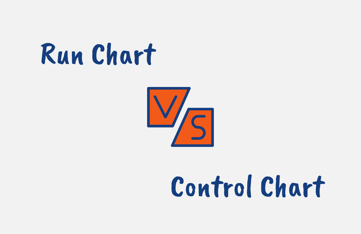
Run charts and control charts are both powerful statistical tools used to analyze trends and patterns in data over time. However, they serve different purposes.
While a run chart shows how a process is performing and helps you visualize shifts or trends, a control chart in addition to doing this also lets you determine if the process is stable and statistically controlled.
If you are looking to fully understand the difference between a run chart and a control chart, this article explores what each chart entails, their benefits, key differences, and when you should use one over the other.
This way, you’ll learn exactly when to use a run chart vs control chart for process analysis.
Run Chart vs Control Chart: Overview
First, let’s overview run charts and control charts individually.
What is a Run Chart?
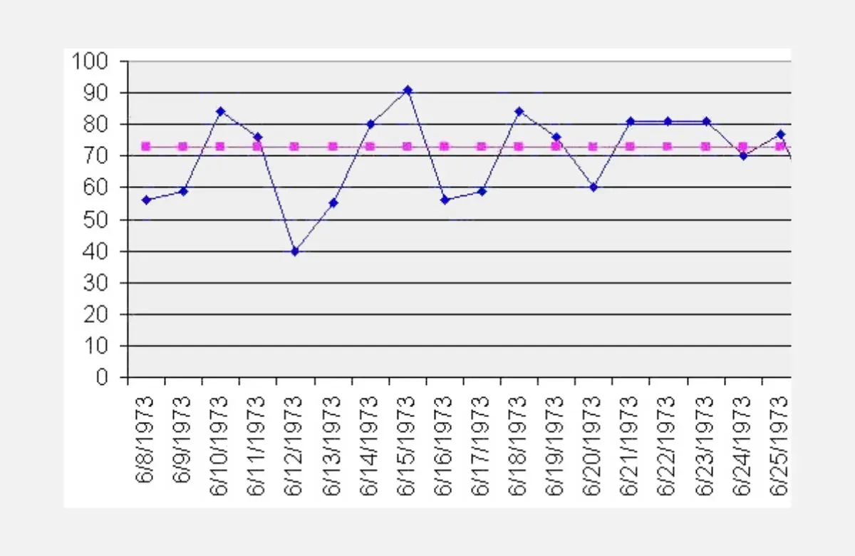
A run chart is a basic graphical tool used to track performance over time. To create one, you plot data points sequentially along a timeline with a center line representing the median value.
This visual makes it easy to see the pattern of data points and if any shifts or trends are occurring.
While run charts do not have any statistical control limits, they provide a straightforward visual for understanding process performance.
With run charts, you can quickly see cycles, upward or downward trends, and anomalies. thus, they are helpful in analyzing things like daily sales figures, wait times, production numbers, or other metrics over time.
What is a Run Chart Used for?
Run charts are used in process analysis and improvement to provide an intuitive way to perform longitudinal analysis, and help you visually understand and share process performance data over time.
Some of their key uses include:
- Visualizing patterns and trends in process data over time. The graphical nature of the charts makes shifts and anomalies easy to spot.
- Analyzing whether a process has improved or worsened to see if your changes are working.
- Comparing data from different time periods. You can view daily, weekly, or monthly metrics together.
- Communicating process performance visibly.
- Identifying stability issues and unusual variations to know when to investigate the process.
- Providing evidence of process issues. Run charts make it easy to demonstrate patterns to others.
Benefits of Using Run Charts
Run charts serve an important analytical role with their simplicity and intuitive visuals providing the main benefits of understanding your process data.
Using run charts has several benefits including:
- They are easy to create and require minimalistic statistical skills. You just have to plot your data points over time.
- Run charts make trends and shifts in your data visually obvious. You can see cycles, downward trends, outliers, etc.
- Run charts can be made manually or with basic spreadsheet tools without needing complicated software.
- They require little data cleaning or manipulation beforehand as the raw data can be plotted as-is.
- They help you identify stability issues and unusual process variations requiring investigation.
- Run charts provide an intuitive way to understand and communicate process performance using visuals that make issues clear.
- They facilitate the analysis of data from different time periods together, like days, weeks, or months.
- You can assess if your process changes are working and if performance is improving.
- Run charts are versatile and can track any metric over time like sales, wait times, production, etc.
What is a Control Chart?
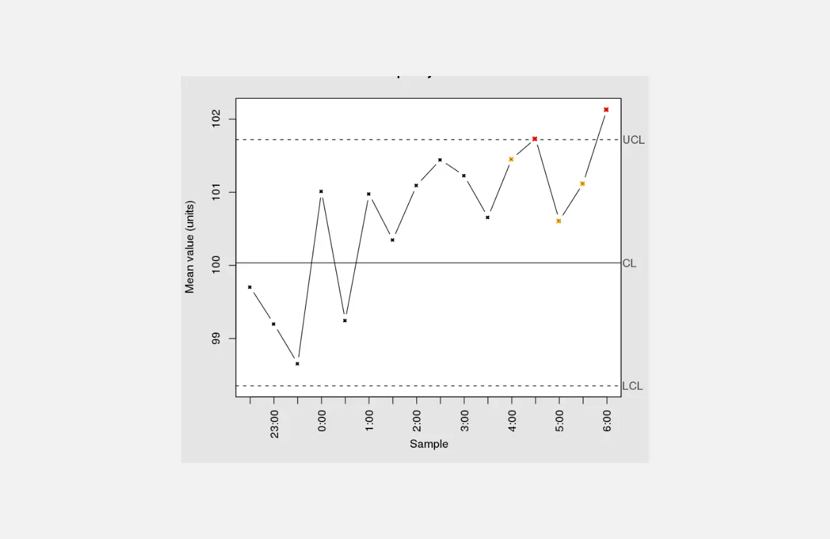
A control chart takes the run chart further by adding statistical control limits. It has a center line representing the process average, with upper and lower control limits on either side.
The control limits are calculated from historical data, usually set at 3 standard deviations from the average. They define the expected range of normal variation.
Control charts also sometimes have specification limits set by requirements. The control limits help you determine if the process is stable and statistically controlled.
If data points fall outside them, the process needs investigation. Control charts are more statistically rigorous than run charts.
What is a Control Chart Used for?
Control charts are very valuable for process control and driving improvements based on their control limits. They have several key uses including:
- Determining if a process is stable and statistically controlled. The control limits indicate when the process exceeds the expected variation.
- Identifying patterns and causes of abnormal process variation. Points outside the limits require investigation.
- Understanding sources of variation whether they are from common or special causes to drive appropriate actions.
- Monitoring processes and detecting changes over time that require an intervention.
- Assessing capability to meet specifications using upper and lower specification limits.
- Reducing improper process adjustments through the use of control limits.
- Communicating process performance and control status to others.
Benefits of Using Control Charts
Control charts also have several benefits. These include:
- The control limits help you identify when a process exceeds expected variation and needs investigation. This facilitates driving improvements.
- They make it easy to determine if a process is stable and statistically controlled.
- Control charts help you distinguish between common and special causes of variation.
- They provide rigorous statistical analysis of process data, more so than a run chart.
- The visuals make patterns and trends easy to identify. You can quickly spot oscillations, upward/downward trends, etc.
- You can assess process capability vs specifications with upper and lower specification limits.
- Control charts help prevent over-adjusting processes when actions aren’t needed.
- They facilitate the analysis of metric data over time like production numbers, defect rates, temperatures, etc.
- Control charts make it easy to communicate process performance and control status.

Difference Between Run Chart and Control Chart
While run charts and control charts are both used to analyze data in order to understand process variation over time, there are distinct differences between the two charts which are outlined below:
1. Definition
A run chart is a graph that displays observed data in a time sequence. A control chart is a statistical tool that graphically presents process variation over time and aids in monitoring whether a process is in a state of control.
2. Components
A run chart typically includes data points, a line connecting the data points, and a median (central line). It does not contain upper or lower control limits.
A control chart consists of data points, a central line (average), and upper and lower control limits. It may also have warning or specification limits.
3. Purpose
The main use of a run chart is to identify trends or patterns over time, like shifts or cycles. It’s a simpler way to visualize data for quick insights.
Control charts are used to study how a process changes over time and determine if a process is in statistical control.
The upper and lower control limits are determined by the process capability and represent the threshold at which the process output is considered statistically unlikely (usually set to represent a likelihood of 1 in 350).
4. Statistical Analysis
Run charts do not permit statistical analysis as detailed as control charts because they do not use control limits. They only show the median and individual data points.
Control charts, on the other hand, allow for a deeper level of statistical analysis. They allow you to differentiate between common cause variation (inherent to the process) and special cause variation (due to specific circumstances).
5. Complexity
Run charts are less complex and easier to create. They are often used in the initial stages of the quality improvement process.
Control charts are more complex and require more data to construct. They are used when you need a more detailed view of process behavior and variability and are especially helpful once you’ve identified a problem using a run chart and want to investigate further.

When to Use a Run Chart vs Control Chart?
When should you choose a run chart versus a control chart? Here are some guidelines:
Use a run chart when:
- You want to visualize trends and patterns in your process data over time. The intuitive visuals make shifts and anomalies easy to see.
- You don’t need advanced statistical analysis. You simply want to understand and communicate performance.
- You have limited time and statistical skills. Run charts are quick and easy to construct.
- Your goal is to provide evidence of issues to justify an investigation, not pinpoint causes.
- You want to assess if process changes are leading to improvements over time.
- You need to compare metrics from different periods like daily vs. weekly figures.
Use a control chart when:
- You want to determine if a process is stable and statistically controlled, as the control limits make this easy.
- You need to distinguish between common and special causes of variation.
- You want to use rigorous statistical analysis to drive quality control and improvements.
- Your goal is to monitor ongoing performance and detect any changes requiring intervention.
- You need to demonstrate process capability vs specifications with upper and lower specification limits.
- You have subgroups of data points, not just individual measurements over time.
Overall, if statistical rigor is needed, use a control chart. When visualizing trends is the priority, use a run chart. You need to consider the goals and data when choosing.
Conclusion
In summary, while run charts and control charts both help analyze processes over time, they happen to differ.
While run charts provide intuitive visuals to show trends and patterns, control charts add statistical control limits to determine stability and make the analysis more rigorous.
The key difference lies in the statistical analysis. Run charts visualize performance, whereas control charts enable statistical control of a process.
Now that you know when to apply each one, you can get the most value by using the right chart to provide powerful insights into your processes.