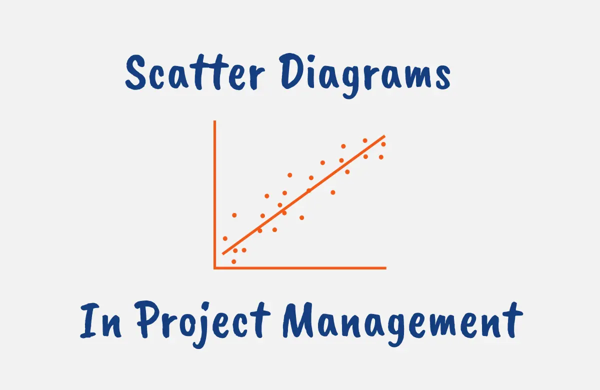
Scatter diagrams are one of the seven basic quality tools and are among the core tools of project management.
This versatile quality control tool allows you to visualize data and identify trends through plotted dots.
While a tad confusing initially, scatter diagrams are quite easy to grasp if you invest a little time, and the knowledge is vital for managing projects.
In this post, we’ll cover what a scatter diagram entails, its role in project quality management, the different types, common uses, as well as tips for interpreting and creating effective scatter diagrams.
If you are preparing for the PMP exam, you need knowledge of scatter diagrams as you can expect a few questions related to this tool. This article will provide you with tips to answer these questions when you encounter them.
What is a Scatter Diagram?
A scatter diagram is a graphical tool used in quality control and quality management to visualize the relationship between two variables by plotting data points on a graph and show how changes in one variable may impact another variable.
To create a scatter diagram, the independent variable is plotted along the horizontal x-axis, while the dependent variable is plotted along the vertical y-axis.
Each data point is shown as a dot on the graph. When you have multiple data points plotted, you can observe the overall pattern and correlation between the variables.
Scatter diagrams are useful when you want to analyze the potential cause and effect between two measurable factors.
The goal is to identify possible causal relationships so that you can address the root cause of defects or quality issues.
Some examples could be examining the connection between temperature and sales of ice cream, or the relationship between budgeted costs and actual costs of a project.
The scatter diagram makes trends, clusters, and outliers visually evident through the data points.
What are Scatter Diagrams Used For?
Scatter diagrams have a variety of uses when it comes to quality control and process improvement.
They are versatile quality tools that help visualize correlations, patterns, outliers, and more in data.
This empowers data-driven decision-making and targeted process improvements. Some of the main uses and applications of scatter diagrams include:
- Identifying Correlations: Scatter diagrams help you visually identify if two variables have a positive, negative, or lack of correlation. This is useful for examining potential cause-and-effect relationships.
- Analyzing Patterns and Trends: The data points on a scatter diagram can reveal clusters, cycles, or other patterns over time. This assists with forecasting and predicting future outcomes.
- Detecting Outliers: Outliers and abnormal data points are easy to spot on a scatter diagram. You can then investigate why these outliers exist.
- Comparing Groups: Different data sets or subgroups can be distinguished through the use of colors or symbols on a scatter diagram. This enables useful comparisons.
- Simplifying Complex Data: Complex relationships between multivariate data are simplified through the scatter diagram’s 2D plot.
- Presenting Convincing Evidence: Scatter diagrams provide clear and convincing visual evidence of relationships in data.
When to Use Scatter Diagrams
Scatter diagrams are extremely useful graphical analysis tools that are versatile enough to be applied in many situations.
Here are some guidelines on when scatter diagrams are most applicable:
- When you want to determine if a correlation exists between two variables, scatter diagrams visually display both the direction and strength of any potential correlation.
- When you need to examine and display numerical data trends or patterns over time, the scatter diagram plots make trends clearly evident.
- When you need to assess cause-and-effect relationships between a potential factor and outcome, scatter diagrams help identify leading indicators.
- When you want to distinguish clusters, cycles, or outliers within a dataset. These are easily identified through scatter.
- When you need to simplify complex multivariate relationships into understandable 2D plots, scatter diagrams cut through the complexity.
- When you need to back up hypotheses or quality theories with quantitative evidence, the scatter diagram provides the proof.
- When communicating results and analysis visually to others, scatter diagram plots are simple to interpret.
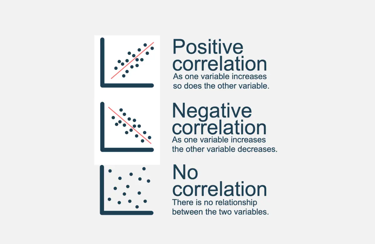
What are the 3 Types of Scatter Diagrams?
Scatter diagrams can be classified based on the type of correlation between their variables.
This correlation occurs when it is determined that there is a connection between the variables, and the direction of the correlation indicates the type of scatter diagram here.
The three main types of correlations seen in scatter diagrams are positive, negative, and no correlation.
Positive Correlation
A positive correlation occurs when two variables move in the same direction – as one increases, so does the other.
On a scatter diagram, a positive correlation is shown by a pattern that slants from the bottom left to the top right.
For example, as the amount of time spent studying increases, exam scores also tend to increase. These variables have a positive correlation.
Negative Correlation
A negative correlation means that as one variable increases, the other decreases. On a scatter diagram, a negative correlation is shown by a pattern slanting from top left to bottom right.
For example, as the price of fuel rises, new car sales tend to decline. The variables have a negative correlation.
No Correlation
When two variables have no correlation, there is no discernible relationship between them. The data points on the scatter diagram will be randomly dispersed.
For example, shoe size and height do not correlate as changes in one variable do not affect the other.
It’s important to note that correlation does not equal causation. Just because two variables are correlated does not necessarily mean that one causes the other. The correlation could be coincidental or due to other factors.
How to Create a Scatter Diagram (Excel)
Creating an effective scatter diagram in Excel is straightforward, just follow these key steps:
- Identify the two variables you want to plot and the time frame of data you will use. These will form the x and y axes.
- Gather the dataset for each variable that covers the desired time period. Input the data into a spreadsheet program (Excel for this case)
- Plot the first variable along the horizontal x-axis. This is typically the independent or input variable.
- Plot the second variable along the vertical y-axis. This is usually the dependent or output variable.
- Mark each data point on the graph as a dot located at the intersection of the x and y values.
- Add labels and a title to clearly define each variable and the purpose of the scatter diagram.
- Add trendline (optional) – include a linear regression trendline to visualize the trend and direction of correlation.
- Use colors, shapes, or sizes to distinguish multiple data sets for comparison (if needed).
- Analyze patterns and trends in the data points. Identify clusters, correlations, outliers, etc.
- Draw insights on the relationships and patterns uncovered between the variables.
With newer data visualization tools, creating scatter diagrams is easier than ever. Many spreadsheet programs have built-in scatter graph capabilities.
Alternatively, use online graphing apps or data visualization software to quickly generate high-quality, customized scatter diagrams in minutes.
Scatter Diagram in Quality Control
Scatter diagrams are an invaluable quality control tool used across many industries and processes for Six Sigma and other quality programs.
They enable quality professionals to visually identify and analyze relationships between different factors that may impact product quality.
Some examples of using scatter diagrams in quality control include:
- Plotting defect rates against time to identify trends or patterns in the defects over time. This helps pinpoint where in the process the defects are occurring.
- Comparing the hardness of a material against its tensile strength to assess whether hardness impacts strength. The scatter diagram visualization quickly shows any correlation.
- Examining the relationship between oil viscosity and engine wear to determine if viscosity levels affect engine durability.
- Analyzing concentrations of input chemicals versus contaminants in outputs to identify which inputs contribute to increased contaminants.
- Tracking ambient temperature and number of defects to assess if seasons impact defect rates.
In each case, the scatter diagram provides vital visual evidence of correlations that may point to the root causes of quality issues.
This enables proactive improvements to processes, rather than reactive fixes after defects occur.
Advantages and Disadvantages of Scatter Diagrams
Scatter diagrams offer many benefits as an analytical tool, but also have some limitations to be aware of.
Scatter diagrams’ advantages include:
- Scatter diagrams visualize correlations between data variables that may not be obvious from raw numbers alone.
- They identify patterns, trends, clusters, outliers, and anomalies within data sets.
- They simplify complex multivariate relationships down to straightforward 2D plots.
- Scatter diagrams are intuitive charts that are easy for broad audiences to interpret.
- They help assess cause-and-effect relationships between inputs and outputs.
- They are low-resource charts that are fast and easy to create.
- They provide useful evidence to support theories, hypotheses, and arguments with quantitative backing.
- They aid forecasting, prediction, and data-driven decision-making.
Their disadvantages include:
- They only display correlation, not causation between variables.
- They are prone to biases based on limited data points in smaller data sets.
- It is difficult to plot more than two or three variables effectively.
- They cannot convey detailed numerical analysis and statistics.
- it is challenging to display large data sets without overcrowding.
- The audience may draw incorrect conclusions from scatter diagrams without statistical expertise.
Overall, scatter diagrams are simple yet powerful tools to visualize potential relationships and patterns in data sets.
But rely on rigorous statistical testing before drawing definitive conclusions on causes and effects solely from scatter diagrams.
Use them for data exploration and analysis, and not necessarily for deciding outcomes.
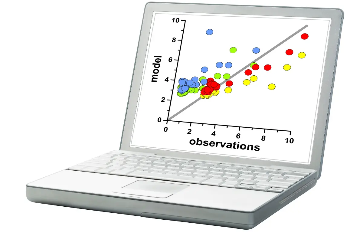
Scatter Diagram Example
The scatter diagram can be utilized in a variety of industries and applications to compare two variables for any data model.
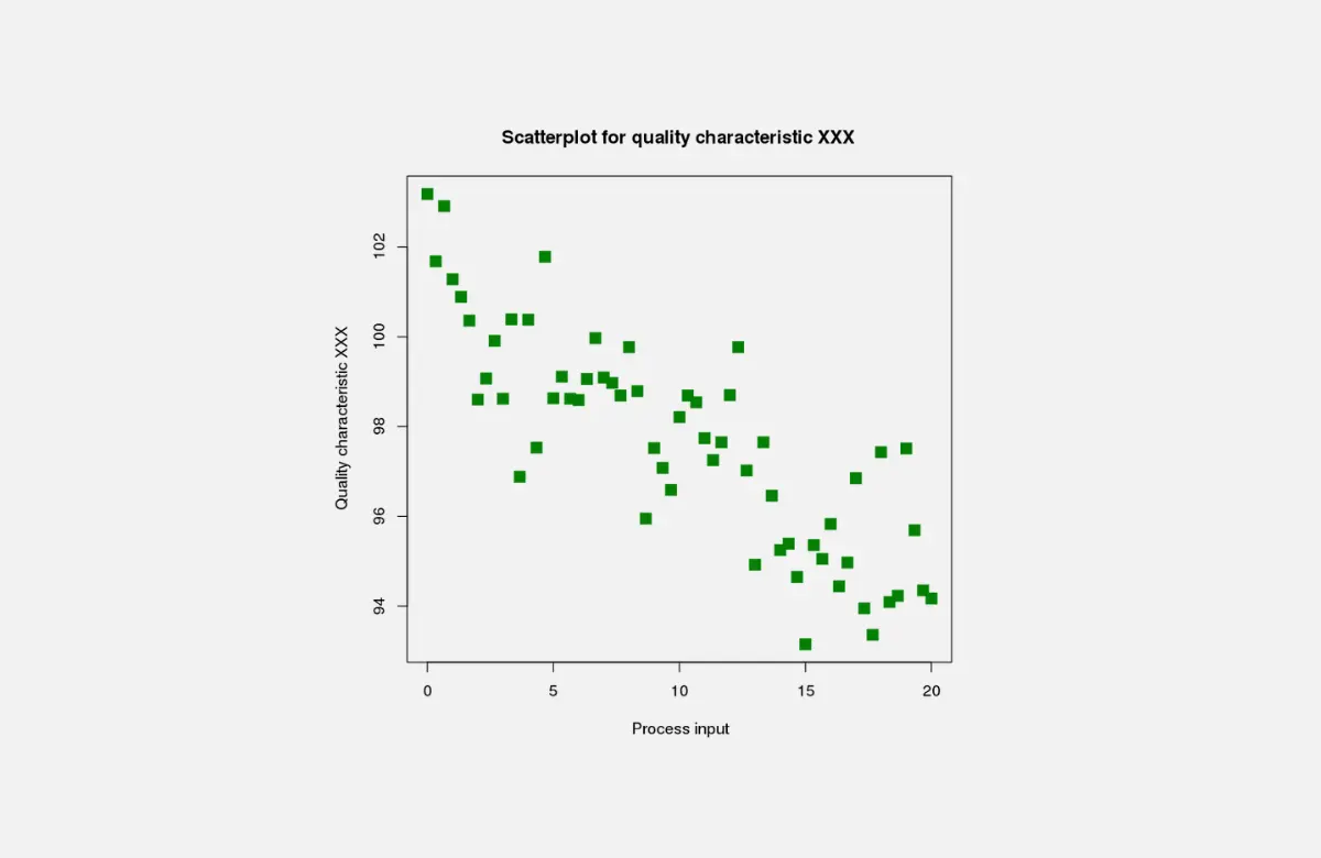
Let’s take an example where as a quality manager, you use a scatter diagram to analyze the relationship between two variables in your manufacturing process.
To understand if machine runtime impacts the defect rate, you gather data on:
- Machine runtime hours
- Number of defects
Plotting this data into a scatter diagram:
- Independent X-Axis: Machine runtime hours
- Dependent Y-Axis: Number of defects
After plotting all the data points, you see the scatter diagram shows a positive correlation. As runtime hours increase, the number of defects also increases.
For example, machines with only 40 runtime hours last week had around 10 defects. However, machines with over 60 runtime hours had 15 defects. And machines with 80+ runtime hours had over 20 defects.
The scatter plot clearly visualizes for you the positive correlation between high machine runtime and more frequent defects.
This suggests wear and tear associated with excessive runtime may increase defect rates.
You can now explore preventive maintenance plans to reduce extended machine runtimes to improve quality by lowering defect rates.
The scatter diagram has provided critical visual evidence of the correlation between runtime and defects.

Scatter Diagram PMP Exam Tips
For your PMP certification exam, you must understand what scatter diagrams are, their types, and how they are used for project quality management.
These diagrams help in identifying and analyzing the relationships between two variables in a project and are used for data representation in the Manage Quality and Control Quality PMBOK guide processes.
They help in determining if a change in one variable is causing a change in another, which is crucial in identifying potential risks or evaluating process efficiencies.
Another important point to consider is that scatter diagrams don’t necessarily demonstrate a cause-effect relationship, but rather, they indicate correlations that can be positive, negative, or show no correlation. The presence of a correlation doesn’t imply causation.
Understanding these aspects of scatter diagrams will prove beneficial when tackling PMP exam questions related to quality management processes.
Conclusion
In summary, scatter diagrams are simple yet powerful quality tools for visualizing connections and patterns in data. By plotting two variables on the X and Y axes, you can identify correlations, clusters, trends, and outliers.
Scatter diagrams help assess relationships between inputs and outputs to find factors that influence quality and performance.
While they show correlation and not causation, scatter plots enable smarter data-driven decisions through understandable 2D visuals.
Next time you need to analyze the potential relationship between two measurable variables, turn to the versatile scatter diagram for clear visual insights.
FAQs
What is a Scatter Diagram in the Context of Project Quality Management?
A scatter diagram in project quality management is a graphical tool used to understand the relationship between two variables.
It helps identify correlations, trends, or patterns, aiding in problem identification, root cause analysis, and process improvement.
Why is a Scatter Diagram Important in TQM?
A scatter diagram is crucial in Total Quality Management (TQM) as it helps visualize correlations between two variables.
It assists in identifying dependencies, predicting outcomes, pinpointing issues, and guiding improvements, thereby enhancing overall quality and performance.
What is the Difference Between Correlation and Scatter Diagram?
Correlation is a statistical measure expressing the degree of relationship between two variables, ranging from -1 (negative correlation) to +1 (positive correlation).
A scatter diagram is a graphical representation used to visually depict this relationship or lack thereof between two variables.