When using Agile for managing projects, transparency and visibility into team progress are crucial. An invaluable tool for tracking work completed in a Sprint is the Sprint Burndown Chart.
This is a visual report that allows Product Owners and teams to monitor if the right pace is being maintained to meet their Sprint Goals.
In this post, we’ll explore what a Sprint Burndown Chart is, its purpose in Agile software development, how to create and read these charts, and how it differs from related artifacts like burnup charts and the Sprint Backlog.
You’ll learn practical guidance to start leveraging Sprint Burndown Charts for your user stories and Sprints.
What is a Sprint Burndown Chart?
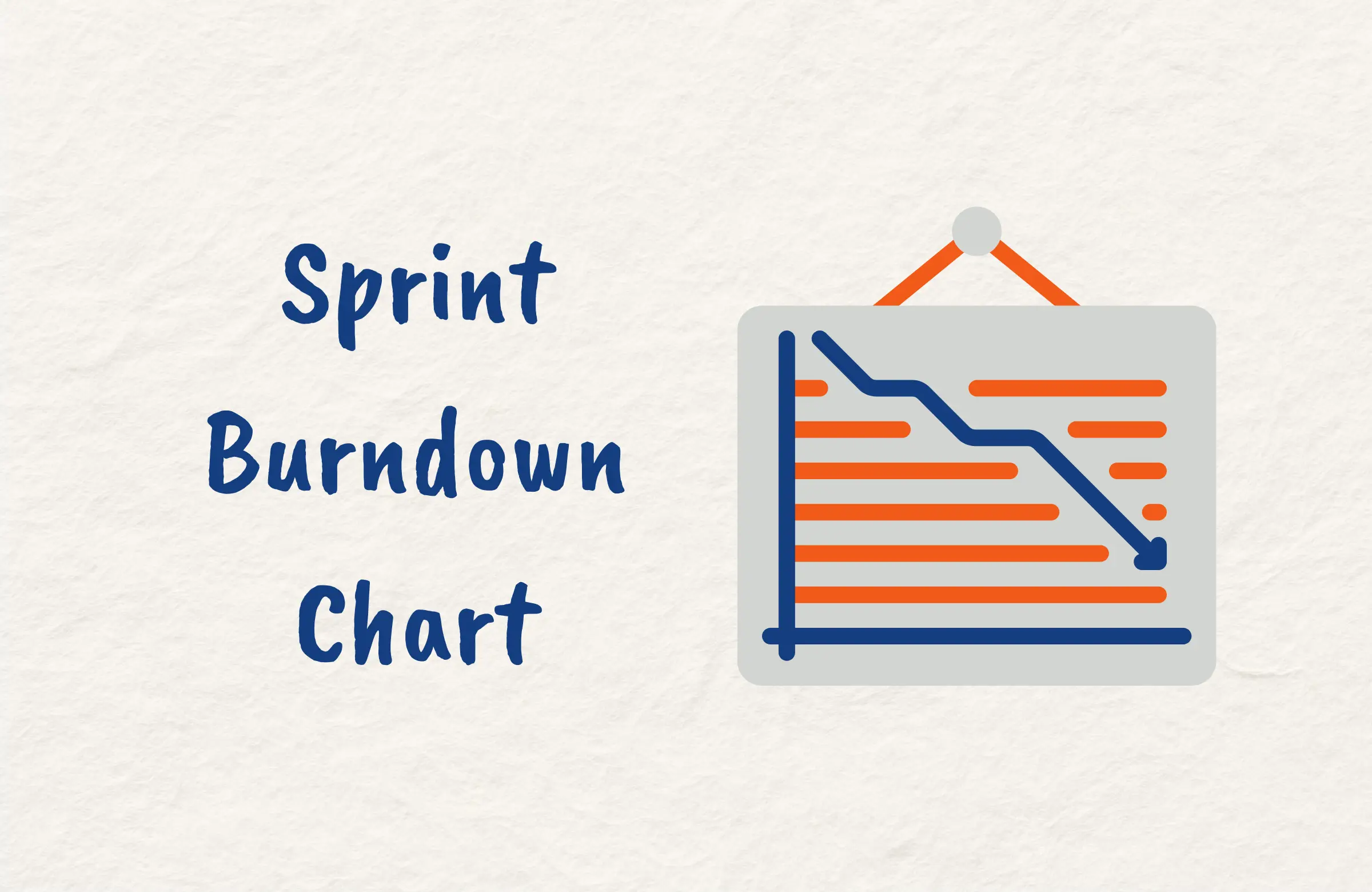
A Sprint Burndown Chart is a graphical representation of the work remaining across the timeframe of a Sprint. It visually depicts the correlation between the amount of work planned for the Sprint and the amount of work remaining on a day-to-day basis.
The chart contains two lines which are the ideal burndown line and the actual burndown line. The ideal burndown line represents the user stories or tasks that should be completed each day to finish all Sprint work by the end goal, while the actual burndown line shows the real amount of work finished each day.
Agile teams aim to have the actual burndown line track as close to the ideal burndown line as possible. This shows that the team is working at an optimal pace and is on track to complete the planned Sprint work. If the lines diverge, it indicates a need for the team to adjust to accomplish the Sprint Goal.
Purpose of Sprint Burndown Chart in Agile
The Sprint Burndown Chart serves several important purposes for Agile teams including:
1. Track Sprint Progress
The Sprint Burndown Chart allows the Product Owner, team members, and stakeholders to visually track the progress of work remaining in the current Sprint.
Monitoring the gap between the ideal burndown line and the actual burndown line informs if the team is on pace to complete the expected scope of work by the end of the Sprint.
2. Identify Scope Creep
An upward-trending actual burndown line may indicate scope creep occurring within the Sprint. By reviewing the chart, the Product Owner can identify user stories added after Sprint Planning and discuss whether the new stories are appropriate for the current Sprint.
3. Assess Estimation Accuracy
A divergence between the actual and ideal burndown lines could mean the initial story point estimates for the Sprint were inaccurate. The Sprint Burndown Chart allows the team to pinpoint stories that were over or underestimated and to adjust estimations in subsequent Sprints.
4. Foster Transparency
The public visibility of the Sprint Burndown Chart provides transparency into the team’s progress and workload. This allows stakeholders to have clear expectations of what can be delivered and promotes collaboration between team members if any issues arise.
How to Create a Sprint Burndown Chart
Creating a useful Sprint Burndown Chart requires some key steps and considerations. Follow these steps to create a Sprint Burndown Chart:
1. Determine Units of Measurement
First, decide the unit of measurement for the vertical axis. Common options include story points, hours, or the number of tasks. Using story points allocated during Sprint Planning works well since it accounts for relative effort.
2. Identify Total Scope
Next, determine the total number of story points or tasks for all user stories in the Sprint Backlog. This will set the starting point for the vertical axis of your chart.
3. Plot the Ideal Burndown Line
With the total scope known, plot a diagonal ideal burndown line sloping from the top of the vertical axis to zero at the end of the sprint timeframe. This line represents the optimal pace for completing the sprint work.
4. Track Daily Progress
Each day, tally the number of story points or tasks finished so far and plot the actual burndown line to show cumulative progress. The gap between the ideal and actual lines indicates the remaining work.
5. Update Estimates
If new or changed user stories are added to the Sprint, then update the total scope and ideal burndown line accordingly. Where there are significant spikes in the chart is an indication of likely scope creep.
6. Automate With Tools
Manually plotting burndown lines is time-consuming. Many Agile software tools like Jira automate chart generation using scope data from the Sprint Backlog which saves a lot of effort.
7. Make Visible to the Team
Post the Sprint Burndown Chart visibly in the team space or share via collaboration tools. Easy access encourages regular review and provides transparency into Sprint progress for everyone.
8. Inspect and Adapt
If the actual burndown line trends too high, steps like reducing scope or revising estimates may be needed to get back on track. Use the chart to guide proactive adjustments.
How to Create a Sprint Burndown Chart in Excel
You may want to use Microsoft Excel to create your Sprint Burndown Chart. If so, then use this video as a guide.
How to Read a Sprint Burndown Chart
Interpreting a sprint burndown chart takes practice but following some key guidelines will help you extract valuable insights:
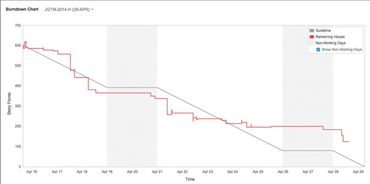
Compare the Ideal and Actual Lines
Focus first on the gap between the diagonal ideal burndown line and the actual burndown line. If they closely match, the team is likely on track to complete the planned user stories for the Sprint. A divergence signals a need to adjust pace or scope.
Assess the Slope of the Actual Line
The slope and direction of the actual burndown line indicate progress efficiency. A downward slope that runs parallel to the ideal line shows consistent productivity. An upward slope means scope was added. A flat line may signify blocked work.
Spot Sudden Changes
Look for unexpected spikes or drops in the actual burndown line as these spikes suggest scope creep from new stories. Drops may indicate errors in tracking completed work that need correction.
Identify Trends
Does the actual burndown line tend to trend up or down from the ideal? Upward trends reflect underestimation or impediments while downward trends can signal overestimation or excess capacity.
Check Remaining Scope
Scan the vertical axis values for the last data points. Higher values warn of the risk that the remaining work exceeds capacity. Lower values provide confidence the Sprint Goal is achievable.
Compare Across Sprints
Contrast trends between successive Sprints. Consistent inaccuracies in estimates or actual throughput may require adjusting planning or capacity.
Discuss as a Team
Treat Sprint burndown review as a team activity. Jointly analyzing the data fosters insights from multiple perspectives and shared ownership of improvements.
Link to Other Metrics
Consider burndown chart patterns in the context of other metrics like velocity and defect rates. The intersection of data from multiple sources helps tell a more complete story.
Difference Between Sprint Burndown and Burnup Chart
Sprint Burndown Chart and Sprint Burndup Chart have the following distinct differences:
Direction of Progress
The Sprint Burndown Chart displays remaining work and trends downward as more work is completed. Conversely, the Sprint Burndup Chart shows completed work and trends upward as progress accumulates.
Ideal Lines
On a sprint burndown chart, the ideal line slopes downward representing the optimal rate of consuming the remaining scope over the Sprint duration. On a Sprint Burndup Chart, the ideal line slopes upward defining the optimal velocity for delivering completed work.
Measuring Accuracy
For a Sprint Burndown Chart, accuracy is measured by how closely the actual line tracks to the ideal Burndown line. On a Sprint Burnup Chart, you want the actual line to follow the ideal Burnup line.
Usage Insights
Since it focuses on remaining work, the Sprint Burndown Chart helps identify when teams may struggle to finish the committed sprint scope. In contrast, the Burnup chart displays completed work so far, allowing assessment of throughput velocity.
Completion Indicators
On a Sprint Burndown Chart, reaching zero remaining work signals the completion of the Sprint. On a Burnup chart, reaching the total scope marks completion.

Difference Between Sprint Report and Burndown Chart
While they both provide Sprint insights, Sprint reports and Sprint Burndown Charts serve different primary purposes and have lots of key differences including:
Purpose
The Sprint report comprehensively summarizes all Sprint activities, results, and metrics. It tells the overall story of what happened in the Sprint. The Burndown chart focuses on visualizing the Sprint scope’s completion status over time.
Scope
Sprint reports cover various aspects like tasks completed, team capacity, velocity, impediments, retrospectives, testing status, and stakeholder feedback. Burndown charts on the other hand narrow in on the correlation between remaining and completed work.
Audience
Sprint reports are more detailed so they are tailored for Product Owners, project managers, and business stakeholders. Burndown charts are intuitive graphical views for all team members and stakeholders to quickly assess sprint progress.
Insights
Sprint reports provide quantitative results and qualitative findings from multiple lenses. Conversely, Burndown charts highlight scope creep, estimation accuracy, throughput trends, and completion risk.
Cadence
Sprint reports are typically created at the end of each Sprint to summarize its events while Burndown charts are updated daily within the Sprint timeframe to enable real-time monitoring.
Burndown Chart vs Sprint Backlog
Likewise, Sprint Burndown Charts and Sprint Backlogs are complementary Agile artifacts that support tracking and planning:
Purpose
The Sprint Backlog outlines the user stories and tasks committed for the Sprint while the Burndown chart displays the visual progress of completing that work over time.
Cadence
The Backlog is created during Sprint Planning and updated continuously as work is completed while the Burndown chart is generated after Sprint Planning and updated daily.
Insights
The Sprint Backlog communicates what work will be done. In contrast, the Burndown chart reveals the rate of completion and gaps between ideal and actual progress.
Estimation
The Sprint Backlog lists user stories with story point estimates while the Sprint Burndown Chart shows the total points as the starting scope.
Visibility
The Sprint Backlog provides details on stories and tasks while the Burndown chart shows big-picture completion trends.
Adjustments
Scope changes are made directly in the Sprint Backlog. The Burndown chart on the other hand reflects those edits to re-forecast the completion pace and date.
Completeness
A backlog with no remaining items signals work completion. The chart hitting zero remaining points confirms completion.
Conclusion
The Sprint Burndown Chart is an invaluable tool for Agile teams to track progress and identify risks to meeting Sprint commitments visually.
By regularly reviewing and reacting to burndown data, you can keep your Sprints on a path to success. Mastery of this technique comes with experience.
As you continue your Agile journey, the insights gleaned from sprint burndown charts will become integral to your team’s ability to plan, prioritize, and deliver value efficiently across every Sprint and Product Increment.
FAQs
Who Updates Sprint Burndown Chart?
The Scrum Master or Product Owner typically creates and updates the sprint burndown chart daily. They track the progress completed each day based on the status of user stories and tasks in the Sprint Backlog.
The whole team also can collaborate to update the chart, which fosters a shared understanding of Sprint progress and goals.
How is Sprint Burndown Measured?
Sprint burndown is measured by comparing the amount of work remaining each day to the total scope committed for the sprint. The remaining work is tracked by tallying the incomplete story points or task hours in the Sprint Backlog.
Burndown represents the decrement of remaining work over the Sprint timeframe toward the goal of zero.
How Often Should Burndown Charts be Updated during a Sprint?
Burndown charts should be updated daily throughout the Sprint timeframe. Daily tracking of work completed allows the Product Owner and team to monitor progress and identify any deviations from the optimal pace needed to complete the sprint scope.