
If you are not leveraging tornado diagrams for your project management processes, you could be missing out on a game-changer.
This unique charting tool provides a visually effective way to perform sensitivity analysis on uncertain project variables. It is also a key project risk management tool to note if you are working towards your PMP certification.
By understanding the potential risks and opportunities tied to key assumptions and forecasts, you can make informed decisions and forecasts for your project under uncertainty.
In this post, we’ll explore how to construct and interpret tornado diagrams to quantify variability, prioritize risk response efforts, and ultimately gain greater control over project outcomes.
What is a Tornado Diagram?
A tornado diagram is a special type of bar chart used to conduct sensitivity analysis on the variables in a model with the goal of understanding how potential changes in key inputs can impact expected outcomes.
Tornado diagrams display all the variables vertically with bars representing the range of outcomes for each variable. The variables are ordered from top to bottom in terms of the size of their impact; the ones with the greatest impact appear at the top.
This creates a tornado-like shape as the bars decrease in size toward the bottom. The wider bars at the top visually stand out, allowing you to easily identify the most sensitive variables.
In project management, tornado diagrams help you model the uncertainty around things like cost estimates, completion dates, or revenue forecasts.
By tweaking the uncertain variables up and down within reasonable ranges, you can quantify possible variations in the outcomes.
This data-driven sensitivity analysis enables smarter planning and risk response. Tornado diagrams bring analytical rigor to project decisions under uncertainty using a visually effective format.
What is the Purpose of Tornado Diagrams?
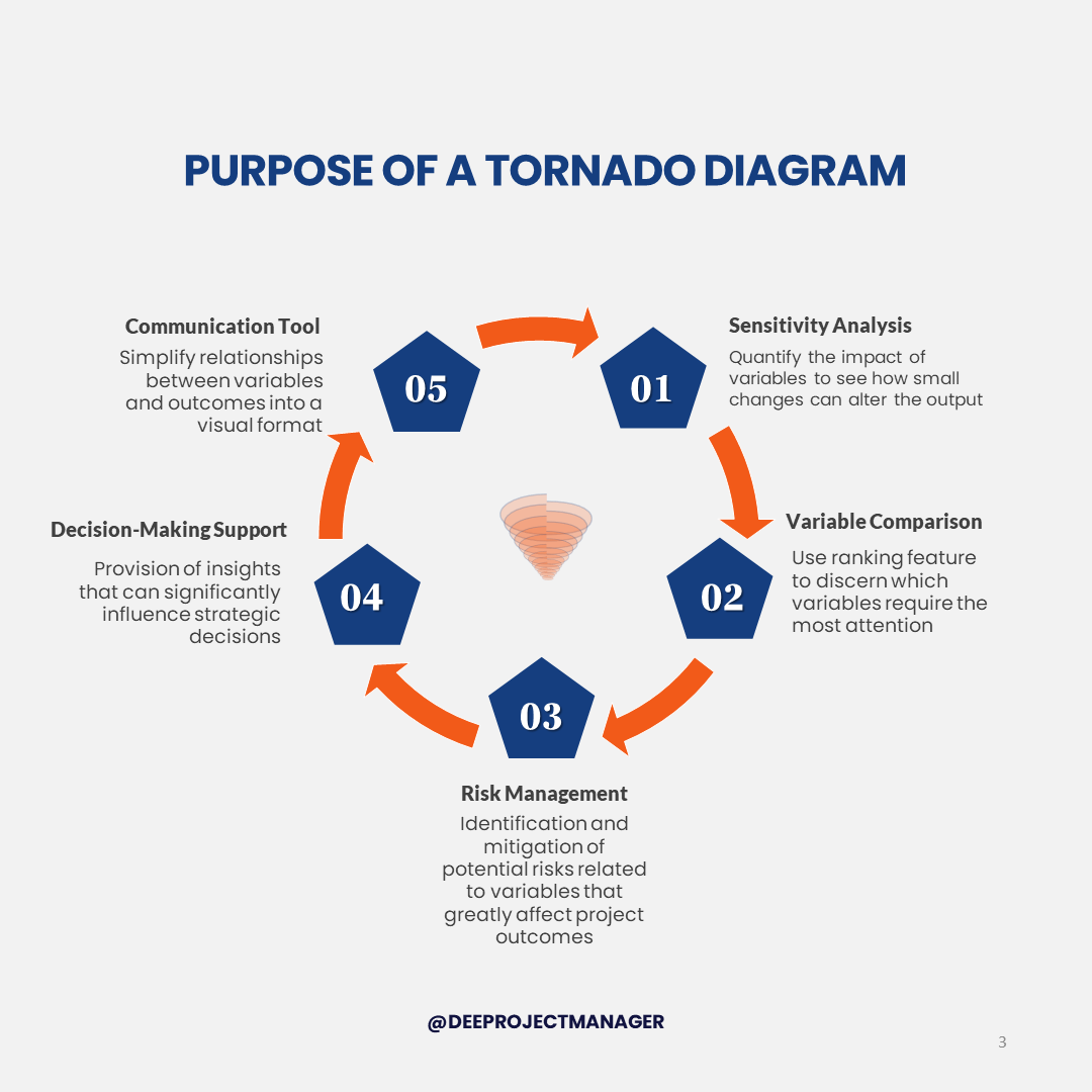
The primary purpose of a tornado diagram is to visually represent and compare the impact of different variables on a specific outcome in a sensitivity analysis. Here’s a breakdown of its main uses:
1. Sensitivity Analysis
Tornado Diagrams not only identify the variables affecting an outcome, but also quantify their impact allowing you to see how small changes in these variables can significantly alter the output, to understand the stability of your model.
2. Variable Comparison
The ranking feature of Tornado Diagrams helps you to discern which variables require the most attention. This understanding can guide the planning and execution of your project, ensuring that high-impact variables are carefully managed.
3. Risk Management
Tornado Diagrams help in identifying potential risks in a project. By understanding which variables can greatly affect the outcome, you can identify and mitigate potential risks related to those variables early in the project.
4. Decision-Making Support
The insights from a Tornado Diagram can significantly influence strategic decisions. For example, if a particular variable has a high impact on the cost of a project, decisions related to this variable, such as supplier selection or quality control measures, become critical.
5. Communication Tool
Tornado Diagrams simplify complex relationships between variables and outcomes into an easily understandable visual format.
This can help in communicating the project dynamics to stakeholders, especially those who may not be involved in the day-to-day project operations, such as senior management or investors.
Parts of a Tornado Diagram
The structure of a tornado diagram is quite straightforward:
1. Vertical Bar Chart
Tornado diagrams take the form of a vertical bar chart. The independent variables are listed on the x-axis while the y-axis depicts the range of potential outcomes for the chosen metric being analyzed.
2. Variables on X-Axis
The x-axis contains each variable being evaluated for its sensitivity. These can be potential cost factors, risk events, project assumptions, or other elements with inherent uncertainty.
3. Outcomes on Y-Axis
For each x-axis variable, the y-axis shows the possible outcome range, from a defined worst-case scenario to an optimal scenario. This quantifies the impact each variable could have.
4. Upside vs. Downside
The y-axis range for each variable starts from its lowest negative impact on the left, to its highest positive impact on the right. This displays both upside opportunities and downside risks in one diagram.
How to Create a Tornado Diagram
Follow these steps to construct an insightful tornado diagram:
1. Define the Model
First, clearly define the project model you want to evaluate. This may be a cost estimate, schedule network, revenue forecast, or other quantitative representation applicable to your analysis.
2. Identify the Variables
Next, collaborate with subject matter experts to identify the uncertain input variables that can impact the model’s results. These are values like activity durations, cost factors, adoption rates, etc.
3. Determine Variable Ranges
For each identified variable, determine a reasonable range of potential values through research and expert judgment. Define an optimistic best case, a pessimistic worst case, and a most likely baseline.
4. Select Outcome Metric
Select the specific outcome metric you want to measure sensitivity for, like total cost, project duration, NPV, or other KPI. This will be the tornado diagram’s y-axis.
5. Calculate Outcome Ranges
With the model and variables defined, perform simulations to calculate outcome ranges. Vary one uncertain variable through its range while holding other variables constant at baseline. Record the low and high outcomes.
6. Rank by Sensitivity
Sort the variables from highest to lowest potential impact based on the size of their outcome ranges. Larger ranges indicate higher sensitivity.
7. Visualize as a Bar Chart
Use spreadsheet software or statistical analysis tools to visualize the data in a vertical bar chart format. Bars depict the outcome range for each variable.
8. Refresh Periodically
Refresh the analysis periodically to keep it relevant as variables change over the project lifecycle. Tornado diagrams bring analytical rigor to navigating uncertainty.
Tornado Diagram Excel
Microsoft Excel is a useful tool for creating tornado diagrams. This video gives you a step-by-step tutorial on how to create tornado diagrams using Excel.
How to Analyze a Tornado Diagram
With a properly constructed tornado diagram, the next critical step is interpreting the results to extract meaningful insights to guide risk management.
Review Outcome Ranges
Start by reviewing the diagram left to right, taking note of the length of each variable’s outcome range on the y-axis. Longer bars indicate higher sensitivity for that particular variable.
Identify Key Variables
Focus first on the variables at the top of the tornado, as these will have the biggest potential impact on the selected outcome metric. Gaining a nuanced understanding of the uncertainties around these sensitive variables should be prioritized.
Plan Risk Responses
Think about how you can respond to reduce the risks or capitalize on opportunities revealed. Potential actions might include mitigation tactics, contingency plans, modulating resource allocations, or adjusting overall project objectives.
Assess Lower Sensitivity Variables
Look at the shorter bars farther down the tornado diagram. These variables have relatively minor effects on the outcome. They likely do not warrant major investments of management attention or risk response resources.
Evaluate Risks and Opportunities
Assess any strong positive skews in the outcome ranges, indicating opportunities for upside, or negative skews pointing to downside risks needing mitigation.
Consider Variable Interactions
Consider interactions between variables and how uncertainties may compound each other. For example, a cost factor decreasing the budget can extend project duration as well.
Track Changes Over Time
Compare tornado diagrams over time to identify trends in how sensitivities evolve across the project lifecycle as new data emerges. Periodic refresh helps maintain relevance.
Communicate with Stakeholders
Leverage the diagram when communicating about risks with key stakeholders. The visual nature enables a clearer understanding of priorities and why they matter.
With this analytical approach, the tornado diagram provides data-driven insights to guide smart planning and decision-making in the face of uncertainty.
Tornado Diagram Sensitivity Analysis
The tornado diagram is an invaluable tool for conducting sensitivity analysis on key project variables. By modeling the potential variability in inputs, sensitivity analysis quantifies the resulting uncertainty in outcomes.
Rather than making guesses or assumptions about risks, the tornado diagram takes a data-driven approach. Each variable is tweaked through a reasonable range to reflect its inherent uncertainty.
The visual format clearly shows which uncertain variables have the largest potential impact on the key metrics like cost, schedule, quality, etc. This enables smart resource allocation to manage the biggest sensitivities.
Tornado diagrams bring analytical rigor to identifying your project’s biggest risks and opportunities. The graphic nature enhances understanding of interrelationships and priorities.
Since variables can change over time, it is important to periodically re-run the analysis. Update input ranges and re-calculate outcomes. Then refresh the tornado diagram visual.
This will reveal any shifts in sensitivity ensuring attention remains focused on the current critical uncertainties. Sensitivity analysis should be an ongoing process, not a one-time exercise.
By making uncertainty analysis core to your risk methodology with tornado diagrams, you can make informed decisions and plans no matter the variability your project faces.
Benefits of Tornado Diagrams
Tornado diagrams provide numerous benefits for project managers seeking to leverage analytical rigor in planning and decision-making by helping to:
- Quantify Uncertainty: Tornado diagrams allow you to model the potential variability inherent to key assumptions and forecasts enabling realistic quantification of risks.
- Prioritize Response: By revealing sensitive variables, tornado diagrams help you intelligently allocate resources to respond to the biggest risks and opportunities.
- Evaluate Tradeoffs: Assess the implications of different scenarios by tweaking variables in the model and examining the outcome ranges.
- Simplify Risk Data: The visual tornado diagram format simplifies the interpretation of complex probabilistic risk data for easier consumption by stakeholders.
- Facilitate Discussion: Tornado diagrams foster collaborative discussion and brainstorming around uncertainties that matter most.
- Identify Interactions: Possible interactions between variables become clearer when assessing their combined impact on outcomes.
- Track Changes: A periodic refresh of the analysis helps monitor risk priorities as variables and sensitivities evolve over the project lifecycle.
- Validate Estimates: Compare actuals against previous outcome range forecasts to validate estimating methods.
- Enhance Oversight: Concisely communicate key risks and uncertainties to sponsors and governance boards.
Limitations of Tornado Diagram
While tornado diagrams are useful for sensitivity analysis, they do have a few limitations:
- Independence of Variables: Tornado diagrams assume that variables are independent and do not interact with each other. In real-world scenarios, this might not be the case. Interactions between variables can significantly affect outcomes.
- Linear Relationships: The diagram assumes a linear relationship between input and output. However, in many projects, the relationship might be non-linear, which the diagram cannot accurately represent.
- Limited Variables: Tornado diagrams are most effective with a small number of variables. As the number of variables increases, the diagram can become difficult to interpret.
- Lack of Probability: Tornado diagrams do not inherently account for the probability of variations in the input variables. While they show the impact of changes, they do not indicate how likely these changes are.
- Over-simplification: A tornado diagram simplifies complex projects, which can lead to overlooking important nuances. It’s a high-level tool that does not delve into the specifics of each variable.
Given these limitations, it’s important to use tornado diagrams in conjunction with other risk assessment and management tools for a comprehensive understanding of a project’s uncertainties.
Tornado Diagram Alternatives
While tornado diagrams are a popular sensitivity analysis tool, there are also alternatives to consider:
- Sensitivity Table: Sensitivity tables list the variables and their potential high/low outcomes in a tabular format rather than visually. This allows large volumes of data but lacks a tornado diagram’s intuitive visual impact.
- Sensitivity Graph: Sensitivity graphs plot the outcome on a line chart as each variable is changed. The steeper the slope of the line, the higher the variable’s sensitivity. It is easy to generate but less compact than tornado diagrams.
- Spider Chart: Spider charts visually represent multiple variables on different axes radiating from a center point. They provide a multivariate view but can get visually overwhelming.
- Monte Carlo Simulation: Monte Carlo simulations use repeated random sampling to model the range of potential outcomes. It is more computationally intensive but accounts for intervariable correlations.
- Partial derivative Analysis: Partial derivative analysis calculates the precise mathematical sensitivity of the outcome to changes in each input variable. This is more complex and it’s focused on local rather than total effects.
Each approach has pros and cons. Using tornado diagrams in concert with supplementary techniques provides flexibility to apply the right sensitivity analysis for your needs.
But tornado’s intuitive visual nature makes it a commonly preferred baseline for many project teams and situations.

Tornado Diagram PMP Exam Tips
If you are preparing for the PMP certification exam, having a clear understanding of tornado diagrams and their application in project risk management can help answer PMP exam questions accurately.
For the Perform Quantitative Risk Analysis process in project risk management, the tornado diagram is referenced by the PMBOK guide 6th Edition as one of the tools used for sensitivity analysis.
Some helpful exam tips include:
- Understand the Definition: Know what a tornado diagram is and how it is used in sensitivity analysis.
- Know Its Purpose: Understand the purpose of tornado diagrams in comparing the importance and impact of different variables.
- Understand its Role in Risk Analysis: Remember that the tornado diagram is used as a tool in the Perform Quantitative Risk Analysis process.
- Recognize a Tornado Diagram: Be able to identify a Tornado Diagram if you see one in an exam question.
Conclusion
In summary, tornado diagrams are an excellent addition to a project manager’s analytical toolkit that enables the modeling of uncertainties to identify sensitive variables and quantify risks.
Key benefits for projects include data-driven decision-making, optimized resource allocation, and realistic outcome forecasting.
With their visual approach to sensitivity analysis, tornado diagrams bring needed analytical rigor for navigating the inevitable uncertainties projects face. Their simple and flexible nature makes adoption straightforward.
I recommend all project managers become skilled in constructing and interpreting tornado diagrams, and integrate them into their standard risk management methodology.
Doing so will lead to improved risk response, estimation, and planning thus enabling greater control over project outcomes.
FAQs
What is Tornado Diagram in PMP?
In Project Management Professional (PMP), a Tornado Diagram is a visual tool used in sensitivity analysis. It represents the impact of uncertainty in project variables on the overall outcome, helping to identify and prioritize the most influential variables for effective risk management.
What is a Tornado Diagram Used for?
A Tornado Diagram is used for sensitivity analysis. It visually represents how changes in input variables impact an outcome, helping to identify and prioritize variables with significant effects. This assists in decision-making, risk management, and effective communication of complex data.
What is the Difference Between a Spider Chart and a Tornado Chart?
A Spider Chart, or Radar Chart, displays multivariate data on multiple axes starting from the same point, ideal for comparing an entity’s characteristics. A Tornado Chart, on the other hand, is used in sensitivity analysis to show the impact of variables on a particular outcome.
Is a Tornado Diagram the Same as a Sensitivity Analysis?
No, a Tornado Diagram isn’t the same as Sensitivity Analysis. Sensitivity Analysis is a method to determine how different values of an independent variable impact a particular dependent variable. A Tornado Diagram is a tool used within Sensitivity Analysis to visualize the impact of variables.